Attended: March 22nd, 2012. The symposium was most informative and interactive. Here are some of my notes from it's seminar discussions:
Speaker, Artist and NUCA Alumnai, Adam Bridgland:
-He repeated the importance in considering and planning a future practice. It is best to be continuously involved in your practice, be self-initiated and self-promoted. The best ways, he found doing this were via the social networks, facebook, twitter and especially by keeping a blog.
Speaker Kara Chatten and Sheila McGregor, from Axis:
-Two Artist Statements were handed out where the top sheet asked questions, such as, "Did it engage you?". After reading both very different statements, it made me think that the most successful statement would have probably been a mixture of both statements. Bringing the professionalism and revealing identity of the artist and their work together into one structure.
-Also, brought up, was the concept of labelling a piece of work 'Untitled' and whether it was reductive. Titling a work provides the work, with a form of narrative which can often be too revealing, which was the overall consensus of the group.
Speakers Charlotte Peel from SCVA:
-They presented how involved artists could be with programs offered at SCVA. I was most interested in their educational services and asked about Art Therapy incorporations. Charlotte Peel asked me to email her, which I've done and am awaiting reply about possible voluntary work.
Aid and Abet Speakers, CJ Mahoney and Sarah Evans:
-Spoke about the funding, planning and other technical sides to opening and operating Aid and Abet mostly but what I found most pertinent to my personal development was their encouragement to have critical conversations about one's own work through residencies, open cause for exhibitions and at private viewings.
-Also encouraged, were researching into potential galleries before forwarding exhibition proposals. Investigation into the galleries past artists, their work, whether or not the space is artist run and to investigate the physical interior of the space and to surmise whether or not it will be best for you and your work.
-They also brought about the idea to go to 'talks' and to practice what to say at your own PV's before-hand. Its good to know "your sentence", they said, that introduction to who you are and what you do, so that people remember you and what you do and to also, exhibit the passion you have for your work.
Friday, 23 March 2012
Printed in Norfolk: Coracle Publications 1989-2011
"Printed in Norfolk: Coracle Publications 1989-2012
20 March - 21 April 2012
A rare opportunity to see an exhibition and reading room showcasing work by leading small press and artists' book publisher Coracle. Printed in Norfolk focuses on publications produced during a twenty-year period when Coracle directors artist, poet and curator Simon Cutts and artist and writer Erica Van Horn regularly made work with Kings Lynn printer Crome and Akers and book binder Stuart Settle from Fakenham.
On show will be artists' books, poetry, ephemera, catalogues, critical documents and anthologies. Alongside works by Cutts and Van Horn, will be publications produced in collaboration with leading artists (Kurt Schwitters, Thomas Joshua Cooper, Gustav Metzger, Paul Etienne Lincoln and Yoko Terauchi) and poets (John Bevis, Ian Hamilton Finlay, Harry Gilonis, Susan Howe, Cralan Kelder, Thomas Meyer and William Minor).
This is a touring exhibition organised by RGAP (Research Group for Artists Publications) and Helen Mitchell and supported by The Arts Council England and the Henry Moore Foundation. The exhibition is accompanied by a catalogue designed by Colin Sackett and published by RGAP."
(information from: http://www.nuca.ac.uk/thegallery/diary)
Personal Reaction: I attended the Exhibition Tuesday March 22nd, 2012 and found the "Manifestation of The Poem" by Simon Cutts to be one of the most captivating of books. The phrase, "The book is the manifestation of the poem" and "The poem is the manifestation of the book" were printed on either side of one another, on which appeared to be, tracing paper or other form of see-through paper. The sentences were printed backwards, as if being read in the reflection of a mirror. This form of print, was quite visually entrapping and allowed me (the viewer) to stay and reflect upon the phrases. It made me ponder, "Well, which one is it? Is it the poem which is the manifestation of the book or otherwise? Perhaps it is both? How can it be both? Is it some form of duality, where each cannot exist without one another, like how John Keats teaches us happiness cannot exist unless sadness does, in 'Ode to Melancholy'?"
Also, most encapsulating were the photographic works of "Six Jugs" by Bill Culbert, where the spilt water was actually cleverly cut glass. This was revealed to the audience in one of the photos on display. This trickery is most playful and ingenuitive.
The display of print work by Bill Culbert and Simon Cutts, especially, "Some More Notes on Writing and Drinking", I enjoyed and the mergence of tangible objects that were displayed with the books, were most interesting (see below). It made the connection blatantly evident and provided more rich texture, that could unfortunately not be touched behind its glass covers. However, the exhibition did have tables and chairs available where some printed editions were vulnerable to audience interaction.

Photograph of Simon Cutts and Bill Culbert's printed materials, NUCA Gallery, 2012
I also enjoyed reading this quote pertaining to Coracle:
“Coracle has, through her art and books, reinvented the very idea of line, and place,
thus defying lineage and placement. Coracle is that rare vessel that travels lightly,even with substantial gear, and knows how to navigate between waves.”
-Roger Conover, Executive Editor, MIT Press
Merz-Forum Box into Art entry
Using a white box delivered by NUCA employees, the Fine Art students were instructed to construct some form of sculptural art, in whatever way they saw fit. I examined the box, reflecting on its original mechanical construction created from natural elements. The origin in the construction of the box is from a rather faceless industry so I decided to make the box into an unwearable mask where robotic type eyes and a mouth were drawn. This merged the concepts of facelessness, human interaction, mechanical development and the usage of natural resources.


"My Robot", Anne-Marie Gray, 2012
Entry into the NUCA directed Merz Forum Exhibition
Preparing for Photographic Installation-The Degree Show 2012
Wolfgang Tillman's unframed photographic work is secured and exhibited in a most minimalist way, that allows the viewer to reflect solely on the piece of work and no other exterior element, such as framing. I feel this minimalist approach to exhibiting will work well for my photographic installation. It is difficult however, to see how exactly he manages to fasten the work to the walls. I've sent a message to the Galerie Buchholz, Berlin as he had his unframed work on display there in 2010. Hopefully, they can provide some insight into his methods of hanging.


Wolfgang Tillman's installation, Galerie Daniel Buchholz, Berlin, 1 Oct - 11 Dec 2010
installation views by Nick Ash
PDP: Art Therapy Activities
Late May/Early June, I plan to make an Art Therapy Activity Pamphlet of an array of activities suitable for different demographics and situations. I'd also like the materials needed to be cost-effective items and found objects. This activity pamphlet will be used with Sean in July/August and the sessions documented via video to examine his interaction and enthusiasm level enabling me to discover the effectiveness of the activities.
Some links to helpful information in creating these activities:
http://www.arttherapyblog.com/c/art-therapy-activities/
http://www.nursingschools.net/blog/2011/01/100-excellent-art-therapy-exercises-for-your-mind-body-and-soul/
http://psychcentral.com/blog/archives/2011/08/06/art-therapy-exercises-to-try-at-home/
Books with useful information:
-Art Therapy Activities: A Practical Guide for Teachers, Therapists and Parents by Pamela J. Stack

-The Art Therapy Source Book by Cathy A. Malchiodi

Some links to helpful information in creating these activities:
http://www.arttherapyblog.com/c/art-therapy-activities/
http://www.nursingschools.net/blog/2011/01/100-excellent-art-therapy-exercises-for-your-mind-body-and-soul/
http://psychcentral.com/blog/archives/2011/08/06/art-therapy-exercises-to-try-at-home/
Books with useful information:
-Art Therapy Activities: A Practical Guide for Teachers, Therapists and Parents by Pamela J. Stack

(Book Cover) Art Therapy Activities: A Practical Guide for Teachers, Therapists and Parents by Pamela J. Stack
-The Art Therapy Source Book by Cathy A. Malchiodi

(Book Cover) The Art Therapy Source Book by Cathy A. Malchiodi
Wednesday, 21 March 2012
Authorship, Co-Authorship, etc.
My current tutor, Simon Granger and I met for a final tutorial (March 20th, 2012) before the Easter Break and it sounds as if the direction I am taking is an unanimous good one. Incorporating photos of Sean from his childhood will help present him as truthfully and whole-fully as possible. The photos I have accumulated through photography, are great but I felt presented Sean on only one plane. With this incorporation, I am presenting a narrative portrait of Sean, of who he really is and the many aspects of him. With this arrangement, the viewer will be able to surmise their own views and relationships to the work and to Sean, as opposed to having a particular, calculated message to be blatantly compelled on them. By doing this, there is more room for reflection on the viewers part to decide how they feel about Sean and perhaps towards other persons with challenges on the whole. It is difficult to gather a complete understanding of someone by first glance, of only one view but by viewing one's history and current personality and interests, a viewer is able to build up a much richer interpretation.
Of course using images where I am not the author, brought up the issues concerning authorship surrounding my ideas for the Degree Show.
Although the images are not my property, it is in my appropriation of these images, where an audience can engage with Sean. I will be the creator in assembling the most appropriate images to allow the highest level of audience interaction and reflection. I will also be creating my own work with them by editing them, their colour, cropping them to enhance the focal point, printing in particular scale and then of course through curating. The curator is really the editor or even co-author of the work, as they play important part in how the artists work is perceived by the public.
In The Contingent Object of Contemporary Art, Martha Buskirk, speaks about Robert Gober's 1988, Three Urinals and David Hammon's 1990 Public Toilets by explaining that in both cases, the artists were involved in performing "an act of recontexturalisation, by taking a familiar object and transforming it, by changing where it is found or how it is made." (2003, p. 62)
Of course, these works are not only appropriations of a familiar object but are re-visualisations of a former interpretation of the subject, Marcel Duchamp's famous and controversial piece, 1917, "Fountain". A piece he referred to as a Readymade, aslo known as found object or objet trouvé. Many had ideas it was referring to the Madonna or other religious form and had sexual references. Since the photograph taken by Stieglitz is the only image of the original sculpture, there are some interpretations of "Fountain" by looking not only at reproductions but this particular photograph. Tomkins notes that "it does not take much stretching of the imagination to see in the upside-down urinal's gently flowing curves the veiled head of a classic Renaissance madonna or a seated Buddha or, perhaps more to the point, one of Brâncuşi's polished erotic forms." ( Tomkins, Duchamp: A Biography, p. 186.)
I use these works as examples of an acceptable use in the system of recontexturalisation.

Three Urinals, 1988
Paula Cooper Gallery, New
York
(K. Honnef, Contemporary Art,
p. 206)
Paula Cooper Gallery, New
York
(K. Honnef, Contemporary Art,
p. 206)
David Hammon, Public Toilets, 1990

The original Fountain by Marcel Duchamp, 1917, photographed by Alfred Stieglitz at the 291 after the 1917 Society of Independent Artists exhibit. Stieglitz used a backdrop of The Warriors by Marsden Hartley to photograph the urinal.
Monday, 19 March 2012
Papergirl Norwich
I was immediately confused by what Papergirl Norwich was but then it became very clear and simple.
How it works:


How it works:
1) The artists submits work.
2) Papergirl exhibits.
3) Then they roll up the work and distribute the art around the city of Norwich on bicycles for free.
Initial reaction to what exhibition submissions usually are, complicated what Papergirl is, which is a simple venture from the artist's point of view. Exhibition submissions are usually complex and sometimes quite stressful. However, with Papergirl, I printed my work, submitted it to her physical studio and then was given word of a secured venue, Stew Gallery, where work from over 20 artists will be on display and then taken down, rolled up and distributed around the city. I find it a most refreshing approach to displaying work. It makes this part, fun and interesting.
PaperGirl Norwich, The Exhibition:
Private Viewing:
- Monday, March 26, 2012
- 6:00pm until 9:00pm
@ Stew Gallery Fishergate, NR3 1SL Norwich, United Kingdom.
Exhibition will be open to the public
Tuesday- Saturday 10am- 5pm
Tuesday- Saturday 10am- 5pm

(found on http://papergirl-norwich.blogspot.co.uk/)

(found on http://papergirl-norwich.blogspot.co.uk/)
Sunday, 18 March 2012
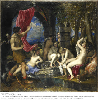
TITIAN's "Diana and Actaeon"-Tour at the Norwich Castle Museum
TITIAN's "Diana and Actaeon"- On Tour From the National Gallery
Talk Given By Mr. Graham Giles
Mr. Graham Giles guided a talk about one of the most important paintings of the Italian Renaissance. Believed to be one of the artist's greatest creations, this became apparent upon immediate reaction to first seeing the work. Its sheer scale presented immense volume in captivating audience attention. The lavish gold frame, which encased the work, certainly aided in embellishing on such visual entrapment. The unity in colour and light and shadow contrast, assisted in the flow of the narration. After reading the poem, Metamorphoses by Ovid, which the painting is based on, it becomes clear why Titian needed to express such a rich piece of literature in a most lavish manner.
Giles pointed out at the end of the talk that an hour spent speaking about and interpreting this piece of art is necessary and he and Mr. Simon Granger, encouraged greater visual examination of the piece. When studying the piece your eye flows throughout the story, investigating the characters and then their surroundings. You then begin to pick up on certain details such as the opposition in size and attitude in the dogs. This particular detail, produces a humouristic element into the story. As well as the detail of the sinking platform which appears to be gushing water under the weight of the nymph.
Its interesting to see the clear past, present and future developments of the poems tale, in the painting. We see the hunter has his bow and arrows and his hound dog, revealing act of past hunting. Acteon is in movement, representing the chance encounter with the goddess, the present and main point of view of the painting. We then can see a Stag skull placed above the bathing nymphs on a column in the background, with what appears to be, pieces of pelt. This signifies the hunters impending doom because of his discovery. The clearly lit, blue sky is quite juxtaposed to the mood of the tale. However, Giles pointed out that the cleaning of such paintings creates difference in colour and tonal range of the original work.
In terms of anatomy, I found myself completely enthralled with Acteon's anatomical correctness and the level of rendering achieved. This, for me, juxtaposed Diana, whose neck and head are oddly placed, directing your eye to her and aiding in making her the focal point of the painting. It was pointed out, at the talk, that this was perhaps intentional as opposed to an error. However, it was also pointed out that the piece would have been worked on by other painters who may have attributed to Diana specifically. Another aspect of the work that guides the eye to Diana is the placement of a dark-skinned woman beside Diana. This difference in light and dark, enhances Diana's presence. Mr. Simon Granger pointed out, that the X-rays of the piece revealed the dark-skinned female may have been originally planned to be a white female. This possible change in direction, suggests that Titian's (and artists' in general) thought process(es) occur(s) continuously through production and not just in the pre-production planning of the work. I find this quite interesting, as it assumed that perfect planning is a natural and necessary incorporation into 'perfect' art and yet it is in the correction and development of ideas, where the perfection lies.
Titian, Diana and Actaeon 1556-1559
Tuesday, 13 March 2012
Artists and Work to consider
The Concept of Mirror and Painting Incorporation:
Diego Velázquez, "Las Meninas"
"The control of Velázquez can perhaps be best seen in the effect of spontaneity and relative informality of the foreground group. The Infanta Margarita, the daughter of the King and Queen of Spain, is made the most central figure in the foreground group by placing her the closest to the center axis of the painting but very intentionally not on that axis. She is placed just to the left of center. At the same time the light streaming in from the window on the right falls on her more than the surrounding figures. The poses of the figures around her with their gestures call attention to their difference to her authority at the same time as acknowledging the presence of the viewer. Seven of the nine figures stare outward. The effect of this, rather than breaking the spell of spontaneity, implicates the viewer into the narrative of the painting. We are made to be as much a part of the composition as any of the other figures in the painting. We take on the role of both the observer and the observed. There is a reciprocity between our looking and that of the characters in the painting. Without our presence, their glances do not make sense. The role we play in this story is revealed by the mirror image just over the Infanta's right shoulder. Our role as the King or Queen of Spain explains the attention paid to our presence by the other figures. The relationship of the Infanta to the royal couple is visually asserted by Velázquez by positioning her closest to the mirror image on the picture plane."
(information found: http://www.oneonta.edu/faculty/farberas/arth/arth200/artist/las_meninas.html)

Diego Velázquez, "Las Meninas" (translated 'The Maids of Honour'), 1656
Personal Reaction: What is most pertinent about this painting towards what I wish to achieve through my concept of mirrored incorporation, is the engagement of the viewer into the narrative of the work. I feel this may be best achieved through naturalism of the main subject and perhaps I achieved this with my most recent exhibition, "Reflection of Self and Societal Image". However, Sean appears to the audience on one plane. They are not allowed to see the full dynamism present in the personality of the individual. Just in the way, Velazquez presents a clear, narrated portrait, I wish to present Sean as such. Perhaps through depiction of varied scenes from Sean's life may aid in this appropriation. This can be achieved in various ways, through a mural-style painting where certain scenes are woven together onto one canvas, a matrix of various photographs of Sean in different points in his life, as well as presentation of his artwork. The latter may come across as a museum like collection of a person's life, making the individual more well-rounded and open.
____________________________________________________________________________________
Michelangelo Pistoletto, Mirror Paintings
"In 1961, after making a series of reflecting black-ground paintings significantly entitled The Present, Pistoletto conducted a series of experiments intended to achieve the highest degree of objectivity—the kind of objectivity shown in the early mirror paintings. To make the background more reflective he tried using aluminum sheets, which he applied to the canvas (Grey Man from Behind, 1961). Finally he identified mirror-finished steel as the best material. To give maximum objectivity to the figure, too, he decided to use photography. Several trials followed. He applied cutout photographic images or photographic gelatin directly to polished steel—a solution he discarded because the photograph continued to look like an inserted object that contrasted with the immateriality of the reflected image. He also tried to use a normal mirror—another solution rejected because of the problems posed by the thickness of the glass. At last, in 1962, he perfected the technique of his subsequent mirror paintings: a sheet of mirror-finished stainless steel fitted with an image obtained by tracing a photograph, enlarged to life size, with the tip of a brush, on tissue paper. After 1971 the painted tissue was replaced by a silkscreen of the photographic image.
The mirror paintings are the foundation of Pistoletto’s oeuvre—both of the artworks he makes and of his theoretical reflection in which he constantly returns to them to study their meaning in depth and to develop their implications. The essential characteristics the artist identifies in them, are: the dimension of time (not just represented, but presented in reality); the inclusion in the work of the viewer and his/her surroundings (which make “the self-portrait of the world”); the joining of couples of opposite polarity (static/dynamic, surface/depth, absolute/relative, etc.), constituted and activated by the interaction between the photographic image and what goes on in the virtual space generated by the reflecting surface; the placement of the mirror paintings no longer at window height, as paintings are traditionally hung, but on the floor (which creates a passage through which the space in which they are shown continues in the virtual space of the work, a door that opens between art and life).
The mirror paintings were first exhibited in Pistoletto’s one-person show at Galatea in April 1963. A few days after the opening Pistoletto went to Paris, where he met the American dealer Ileana Sonnabend, who later bought the entire show and took over Pistoletto’s contract with Galatea.


_____________________________________________________________
ARTISTS WITH DISABILITIES:
The mirror paintings are the foundation of Pistoletto’s oeuvre—both of the artworks he makes and of his theoretical reflection in which he constantly returns to them to study their meaning in depth and to develop their implications. The essential characteristics the artist identifies in them, are: the dimension of time (not just represented, but presented in reality); the inclusion in the work of the viewer and his/her surroundings (which make “the self-portrait of the world”); the joining of couples of opposite polarity (static/dynamic, surface/depth, absolute/relative, etc.), constituted and activated by the interaction between the photographic image and what goes on in the virtual space generated by the reflecting surface; the placement of the mirror paintings no longer at window height, as paintings are traditionally hung, but on the floor (which creates a passage through which the space in which they are shown continues in the virtual space of the work, a door that opens between art and life).
The mirror paintings were first exhibited in Pistoletto’s one-person show at Galatea in April 1963. A few days after the opening Pistoletto went to Paris, where he met the American dealer Ileana Sonnabend, who later bought the entire show and took over Pistoletto’s contract with Galatea.
“I realized there wasn’t any sort of assent or interest around me: in fact there was a certain nervousness and rejection, mainly by the gallery owner himself. So I took a trip to Paris. There I met Beppe Romagnoni who told me about a gallery where strange and interesting paintings were being shown. So I dropped by the Sonnabend Gallery and asked to see these paintings. In this way I first saw Rauschenberg, Jasper Johns, Rosenquist and Lichtenstein’s paintings, and Segal and Chamberlain’s sculptures. They asked me if I was a critic and I said, no, I’m an artist. When asked what I did, I showed them the Galatea catalogue and a painting. They were struck by the work and came to Turin where they bought up the whole Galatea show. They took over the contract with Tazzoli and a situation developed that was extremely important for me: from my isolation in Turin, I was catapulted into an international dimension” (Michelangelo Pistoletto, interview with Germano Celant, cit., 26-29).
The mirror paintings quickly brought Pistoletto international acknowledgement and success, which in turn led to numerous one-person shows in Europe and in the United States (Paris, 1964; Brussels and Minneapolis, 1966; New York, 1967 and 1969; Rotterdam, 1969)."
(information found: http://www.pistoletto.it/eng/crono04.htm#)

Biennale '66, 1962-1966

Palais des Beaux-Arts,
Bruxelles, 1967

Walker Art Center,
Minneapolis, 1966

Walker Art Center,
Minneapolis, 1966
Personal Response: Pistoletto creates an objective presentation to his audience, narratives which the audience is directed into through reflection. In my work, regarding the Bust of Sean facing the mirror, the audience would be forced to engage with the person gazing into the mirror. However, this cold slab of material, fixed in front of the mirror objectifies the person, the sculpture is depicting. He would appear to be a study for the audience as opposed to a real person with real emotions. Pistoletto's directly avoids any kind of objectification since his characters are "painted" directly onto the mirror with no other dimension to disturb the relationship between art and audience. I feel now, the idea of the mirror isn't a necessary object to achieve the concept of reflection and can be obtained in other ways, just like how Velasquez achieved the engagement of the audience through sheer eye contact.
_____________________________________________________________
ARTISTS WITH DISABILITIES:
Yinka Shonibare
Ryan Gander
Frida Kahlo
Chuck Close
Damien Hirst
Artwork Ideas...
1) Make monochromatic painting of Sean. Photocopy painting when dry and test various backgrounds, i.e. Sean's water-colours as back drop and/or old photographs or both.
2) Make prints of various photos and Sean's watercolours to test variations of display. Possible idea for matrix of who Sean is and what he is all about. (Photos/scans of him as a youngster, him painting, and my most recent portraits of him, as well as his artwork). Get past artwork from his childhood to incorporate into it. Design matrix concept in Photoshop to test idea.
3) Test idea of more simplified matrix without certain photos/work.
4) Test ideas of mural painting depicting Sean in various points in his life.
Sunday, 11 March 2012
Ways of Displaying for Degree Show...
Several students of NUCA have used bull-dog clips to hang work, which is quite effective for interior display, as well as cost-effective. I've also noticed numerous artists outside the University incorporate this idea into their method of hanging work. However, I feel this method interferes with the work and I often compare it to Dark-Room photograph development hangings, as well as the binding of manuscripts and other documents. This in not a comparison, I wish my work to have and I also think it cheapens the quality of the work the clips display. I'm thinking of pasting my photograph prints to a backing eg foam board (cost effective) and then fastening to the wall by using eg sticky velcro (strong and cost effective). The foam board will also allow the work to protrude from the wall a bit and allow the work to literally "pop" from the white walls, giving the work a three dimensional aspect, that I find appealing and feel wont interrupt with the intentions of the work.
Prepping for the Degree Show...
In order to prepare for what is most suitable for the Degree Show, I took part in the Art Of Norwich Exhibition and it helped me to realize that traditional prints and framing may not be best for the Degree Show. As, I kept revisiting the exhibition, I felt more and more strongly that the framing helped separate the photographs too much and this segregation most likely, interrupted the intentions of the work. However, an attendant of the show, mentioned to me that before reading my pamphlet that described my intentions, he could clearly see what I was attempting to achieve. It was clear, Sean was looking at himself and also at the viewer engaging the eye, cyclically. This attendant, Liam Poole, writes reviews for the Ip1 magazine (http://www.ip1zine.com/) that discusses art, music, writing and fashion of Ipswich. Therefore, he is used to quickly surmising the intentions of work and delivering the qualities through written word to his readers. However, I was still very pleased to hear an audience member's feedback on this particular aspect.
Regardless, I know I need to present my work as minimalistic as possible, with no interruptions from the method of displaying. I intend to print various sizes of the photos and test hanging them in my space chosen for the Degree Show (Area 13). I'd like to have this done and prepared for a meeting with Mr. Simon Granger. He pointed out to me during a meeting that the work should speak for itself and not need descriptive pamphlets. I am quite a sucker for including these as I never want any audience member to feel confused, even just one person. However, he is absolutely right and I feel, the work does speak for itself but must be presented appropriately so that the intentions are not lost or misinterpreted.
Regardless, I know I need to present my work as minimalistic as possible, with no interruptions from the method of displaying. I intend to print various sizes of the photos and test hanging them in my space chosen for the Degree Show (Area 13). I'd like to have this done and prepared for a meeting with Mr. Simon Granger. He pointed out to me during a meeting that the work should speak for itself and not need descriptive pamphlets. I am quite a sucker for including these as I never want any audience member to feel confused, even just one person. However, he is absolutely right and I feel, the work does speak for itself but must be presented appropriately so that the intentions are not lost or misinterpreted.
On Working On the Bust...
I've been experiencing trouble anatomically, creating the bust of a Downs Syndrome person. My experience lies with middle aged white males. The anatomy of Sean's head is very unique and through study of his facial features, I am no longer confident I can create a bust that will be clear to the viewing public that the subject has Downs Syndrome. Especially since Sean's physical characteristics of Downs Syndrome aren't very severe. I was very willing to keep trying, however, and wanted to prove to myself I could do this. During a one-to-one tutorial with Mr. Simon Granger, it dawned on me that the bust itself might be the problem. I began to visualize it objectively and felt it may be too cold, inhuman and impersonal. It may also objectify the person being represented, the very perception I am attempting to disuade. I kept seeing this slab of a head, empty, a shell of the real person and compared it to my photographs and past paintings, which are warm and inviting. I feel I still have to ponder on the notion of discontinuing this work but am more on the edge that this will not be appropriate in regards to be intended message.
Friday, 9 March 2012
Reaction to My Current Work
A lady, who graduated from NUCA in 2009, with Sarah Faulkes (a fellow-participant artist of the Art Of Norwich Exhibition) asked which work belonged to me, whilst I was invigilating the exhibition on Friday, March 9th, 2012.
I told her which work was mine and she said, "I didn't mention it in your comments book but I found I couldn't look at him. We've been trained to not stare at people who are ill or have challenges and because of that I couldn't even look at him." (approximate quote)
It was very refreshing to hear an honest reaction to the work. She obviously felt uncomfortable writing it, perhaps as she may have thought I would have gotten the wrong impression of her reaction. However, by telling me verbally she was able to get across sincerely, what she felt. I realised that this reaction would be likely amoung certain viewers, if not all viewers. The effort is to allow persons with various disabilities enough exposure to curve these reactions and create new, more realistic perceptions of persons with disabilities. As another commenter (written in my comments book) said, "there needs to be more work like this."
Disability in the 21st Century
"Disabled people are still struggling for the right to use public transport, get into buildings, go to school or college with their friends, or to get a job. Although civil rights legislation, such as the Americans with Disabilities Act (1990) or the Disability Discrimination Act (UK 1995), have helped, disabled people still often feel that the dominant culture sees them as different from everyone else because of persisting stereotypes of disability.
Anyone can, at any time, become disabled, or develop a physical or mental impairment. Perhaps people's need to distance themselves from this harsh reality makes it convenient to rely on received negative attitudes and historical stereotypes of disability. These stereotypical images are less troubling than accepting the individuality, the joy, the pain, the appearance, behaviour and the rights of disabled people. This could explain why disability equality has been called 'the last civil rights movement'.
What disabled people want more than anything else is to be accepted for who they are and to have their rights guaranteed in law and in practice."
Found: BFI, UK's lead film organisation: http://www.bfi.org.uk/education/teaching/disability/thinking/#c21
This site is full of reference to various timelines in human and artistic history in relation to disability. Further investigation to follow.
Downs Syndrome Subjects in Painting
The following was found from, http://www.neatorama.com/2007/11/25/down-syndrome-in-a-sixteenth-century-flemish-painting/.

As Medgadget reports, "Several years ago, psychiatrist Andrew Levitas and geneticist Cheryl Reid made an interesting discovery:
[They] identified a 16th-century Flemish Nativity painting in which one angelic figure appears distinctly different from other individuals in the painting with an appearance of Down syndrome. . . . This may be one of the earliest European representations of Down syndrome.
The British Medical Journal elaborates:
The 1515 Flemish painting, by an unknown artist, . . . shows an angel (next to Mary) and possibly one other figure, the shepherd in the centre of the background with the syndrome.
"If our diagnosis is correct, this implies that Down’s syndrome is not a modern disease," say [Levitas and Reid] (American Journal of Medical Genetics 2003;116:399-405).
The diagnosis of Down’s syndrome in the angel was based on a number of features: a flattened mid-face, epicanthal folds, upslanted palpebral fissures, a small and upturned tip of the nose, and downward curving of the corners of the mouth. The hands, crossed over the breast, have short fingers, especially on the left.
Monday, 5 March 2012
Robyn Woolston
Robyn Woolston, Part of Artist Statement:
"A new set of meta-narratives, that runs counter to our post-modern disregard of overarching belief systems, is playing out within our emotions, behaviours and responses:
I am in deficit, I am weak
I purchase, I am fulfilled
We're safe - We're at risk
You're one of us - You are 'other'
You're a fellow human - You are a terrorist
I don't fit in, I am an outsider
I become more like you, I am a part of your collective"
I purchase, I am fulfilled
We're safe - We're at risk
You're one of us - You are 'other'
You're a fellow human - You are a terrorist
I don't fit in, I am an outsider
I become more like you, I am a part of your collective"
http://www.axisweb.org/seCVFU.aspx?ARTISTID=14341
What intrigues me about Woolston's work is the separation between people's consciousnesses that are collectively put into two separate groups where each person finds themselves being a part of each group at different points in their life. Part of the 'them and us' scenario.

'Smart Price' (2012) - Threshold Festival, Liverpool
132,000 plastic knives and forks
5280 pieces of plastic packaging
330 cardboard boxes
3 letters / harvested from the (now bankrupt) Liverpool Habitat sign
Firing Services + Pre-Cut Acrylic Mirrors
Search for Kiln Firing Services:
Dauncey Stoneware - (Directed to, by Wayne McKinney, NUCA)
W: http://daunceystoneware.co.uk/
E: robin@daunceystoneware.co.uk
T: 01603 664 030
Norfolk Contemporary Craft Society
W: http://www.norfolkcraft.co.uk/
E: http://www.norfolkcraft.co.uk/contact01.php
T: 01603 434710 (Marian Williams)
Mirrored Perplex
A1 Mirrors
http://www.a1mirrors.co.uk/article/pre_cut_acrylic
Doppelganger

Doppelganger, Beverley Hood
Here, Hood, is reflecting on the historical tradition of portraiture and uses digital 3-dimensional work to explore the potential of portraiture in the 21st century. For me, the concept of doppelganger will be quite literally interrupted into the current painting, "Reflection of the Self", where Sean will be looking into the mirror but his reflection will be looking in the direction of the viewer, breaking that fourth wall, rather than returning gaze in the correct direction. This is to explore the idea that the 'learning challenged' individual is more than one dimensional despite what stereotypes iterate. This painting will be similar to the bust/mirror installation, planned for the Degree Show, however, forcing Sean's gaze towards the audience is impossible unless done through painting or digital manipulation. I will embrace painting for personal aesthetic reasons.
The Incorporation of Reflection in Contemporary Art
Light and Reflection- Lynda Cornwall
Inspiration
"There are amazing reflections all around us in the environment where two or more images blend. The reflections in these red, blue and green bottles show how coloured light mixes to produce wonderful secondary and tertiary colours.
The juxtaposition of these bottles might be a metaphor for how we interact - the closer we move towards each other the more we 'reflect' each other's 'colours' or personalities." (Cornwall)
Light and Reflection, Lynda Cornwall

Light and Reflection, Lynda Cornwall
Cornwall's interpretation of reflections, is interesting as she personifies the reaction between light and colour. The idea that humans echo one another in various ways because of constant interaction, explains similarities in family members and friends and the creation of certain cultural groups and even gangs. Similar to the absorption of light and colour through reflections, human kind absorbs the influences that penetrate the individual's senses and thought.
Sunday, 4 March 2012
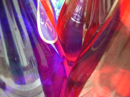
Judith Scott
“She would essentially appropriate objects from the studio and wrap them in fiber, yarn, and fabric to make abstract sculptures. She didn’t have awareness of her work in the world, but she really enjoyed it when people came to the studio and loved how people wanted to meet her. That was a fundamental important thing—from social outcast to people who would make a pilgrimage to see her work, this is not easily accomplished.” (Tom di Maria, Executive Director of Creative Growth, 2008)
Via http://www.divinecaroline.com/24169/47513-transforming-special-needs-contemporary-art#ixzz1oBmoazKv
Tom speaks about Scott after being a part of the Center for two years. What is most fascinating about Scott's practice is her development as a person to be able to reach such a sought after position. She and her work compliment one another. Scott was blind, so she created sculptural pieces that relied heavily on touch, an approach she encouraged her audience to take towards embracing her work. This concept of feeling would create a deeper connection with viewer and artwork. Connection between artwork, viewer and artist is what interests me in regards my practice. By having the Bust facing the reflective surface (installation concept for Degree Show), the audience is propelled into the installation, forcing a visible and physical relationship. What the each audience member chooses to create in terms of relationship towards the bust or rather, the person represented in the bust, is individual and personal.
Scott's life has become a tool, used through literature and film, to aid in disability awareness. Fortunately, the institutionalizing Scott experienced has evolved. There are much more opportunities presented to people with various challenges but socially and culturally, preconceptions about people with challenges are yet to evolved.
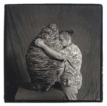
Judith Scott in 1999. Photo: Leon A. Borensztein.

Untitled, 1991-2
and 1991-3; 51 by 10 by 7 inches
and 61 by 11 by 6 inches, respectively.
Huang Guofu
Huang Guofu, "The Armless Painter"


"Huang Guofu is a man who doesn’t make excuses. He lost his arms at the age of 4 in a terrible accident involving electricity. But he never gave up his dream of becoming an artist and taught himself to paint by foot and mouth. He is now the vice-curator of the Chongqing Talents Museum, creating sought-after public masterpieces."


Huang Guofo working on one of his many masterpieces.
Like Judith Scott, Guofu's own self acts as artistic and political symbolism for disability awareness and equality. Their work compliments this relation, as it is evident their works are of high quality and their physical or mental challenges are not constraining from these achievements.I want to let the younger generation know that there are no real obstacles in life. The only obstacle is if you want to do it…~Huang Guofu
Subscribe to:
Posts (Atom)